Explore the design building blocks available on this Archie site. This gallery brings together the component options currently set up for the site, so you can quickly see what is possible.
26 components
Browse the available component options for this site and open any card to see examples in more detail.
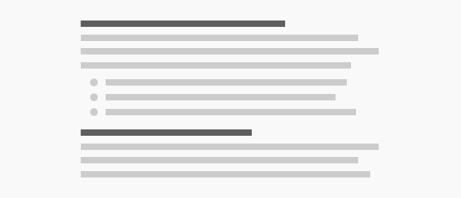
Wysiwyg is the most flexible text-based building block in the library, ideal for longform copy, editorial content, or small sections of formatted text. It works well when a page needs written content without a more specialized layout.
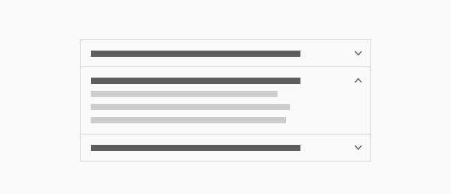
Accordion is used for compact, expandable content blocks, such as FAQs, policies, or grouped details that should stay easy to scan. It works well when you want to keep a page tidy while still giving readers access to more information on demand.
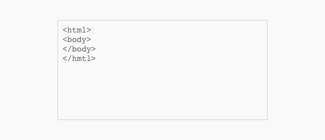
Basic Html/Embed is a flexible content block for simple text, inline formatting, or embedded markup. It is a good fit for short supporting copy, small disclosures, or custom content that does not need a more structured component.
Button Grid gives you a clean way to place several calls to action together in one place. Use it for related links, quick next steps, or a compact action area at the end of a section.
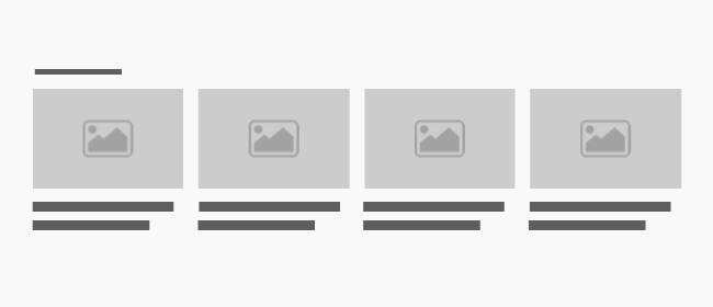
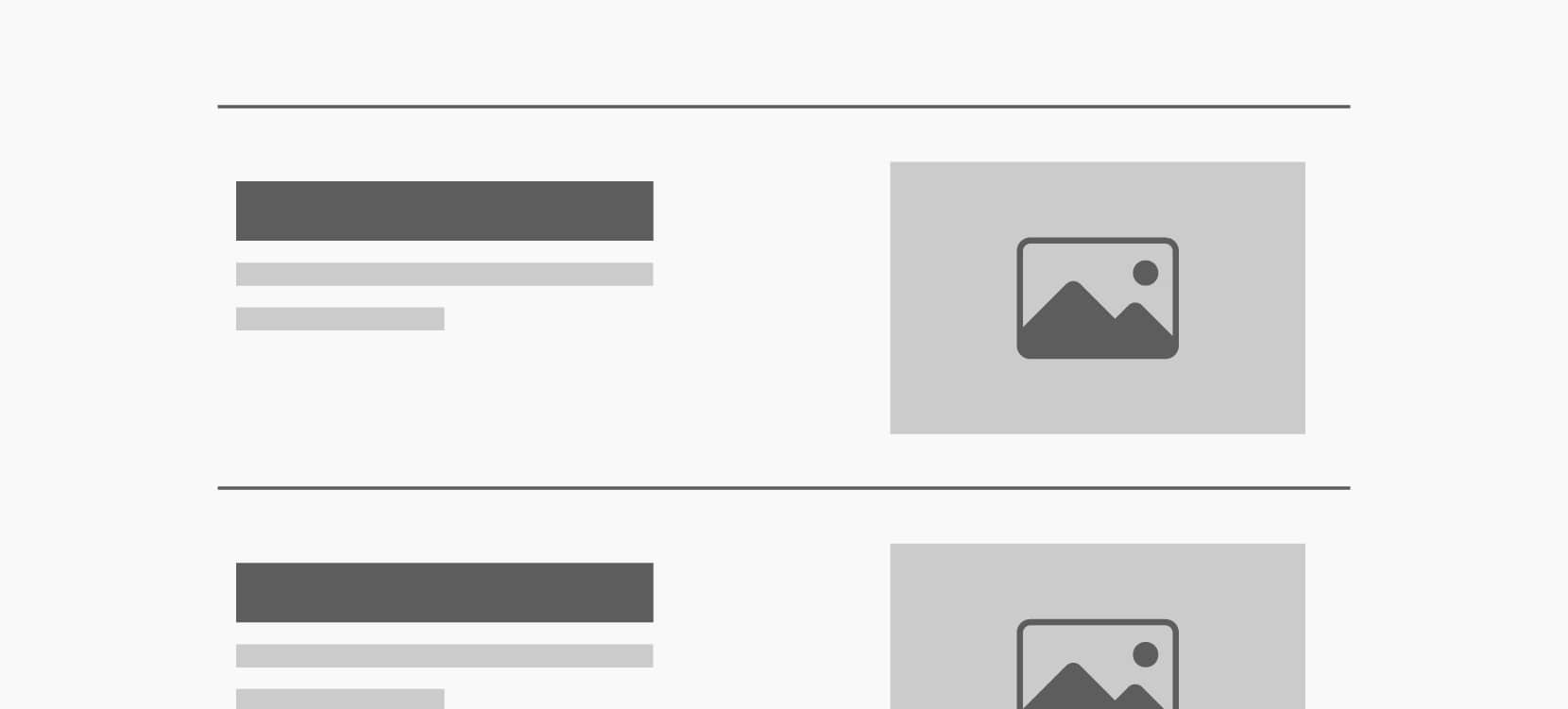
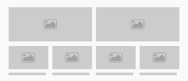
Cards is built for showing a small group of related items with images and short summaries. It works well for featured content, related articles, or a set of destination links that should be easy to browse.
Column is a layout building block for organizing content into a structured column within a larger section. It is useful for balancing copy, media, and supporting details without creating a full standalone layout.
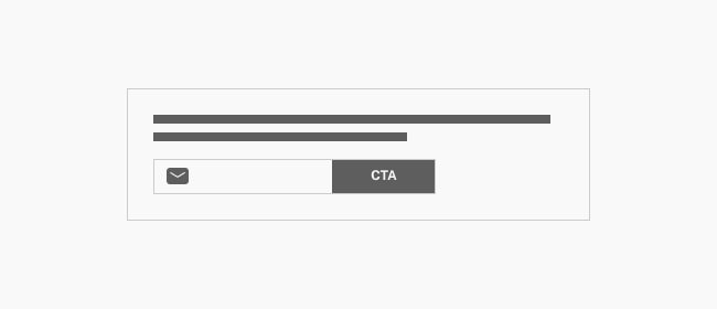
Email Signup is designed for collecting newsletter signups or other audience opt-ins in a clear, focused block. It is a strong fit for homepage calls to subscribe, campaign signups, or a sitewide audience-building prompt.
Event Listing presents upcoming events in a browsable list with enough structure to keep dates and details clear. Use it on community pages, event hubs, or campaign landing pages that need a simple schedule overview.
Featured Post highlights a single article or story with more prominence than a standard list item. It is ideal for editorial calls to action, announcements, or a featured update that deserves extra attention.
Feed is used to surface a stream of content such as posts, resources, or updates in one compact area. It works well for homepage teasers, landing pages, or any section that needs a curated content feed.
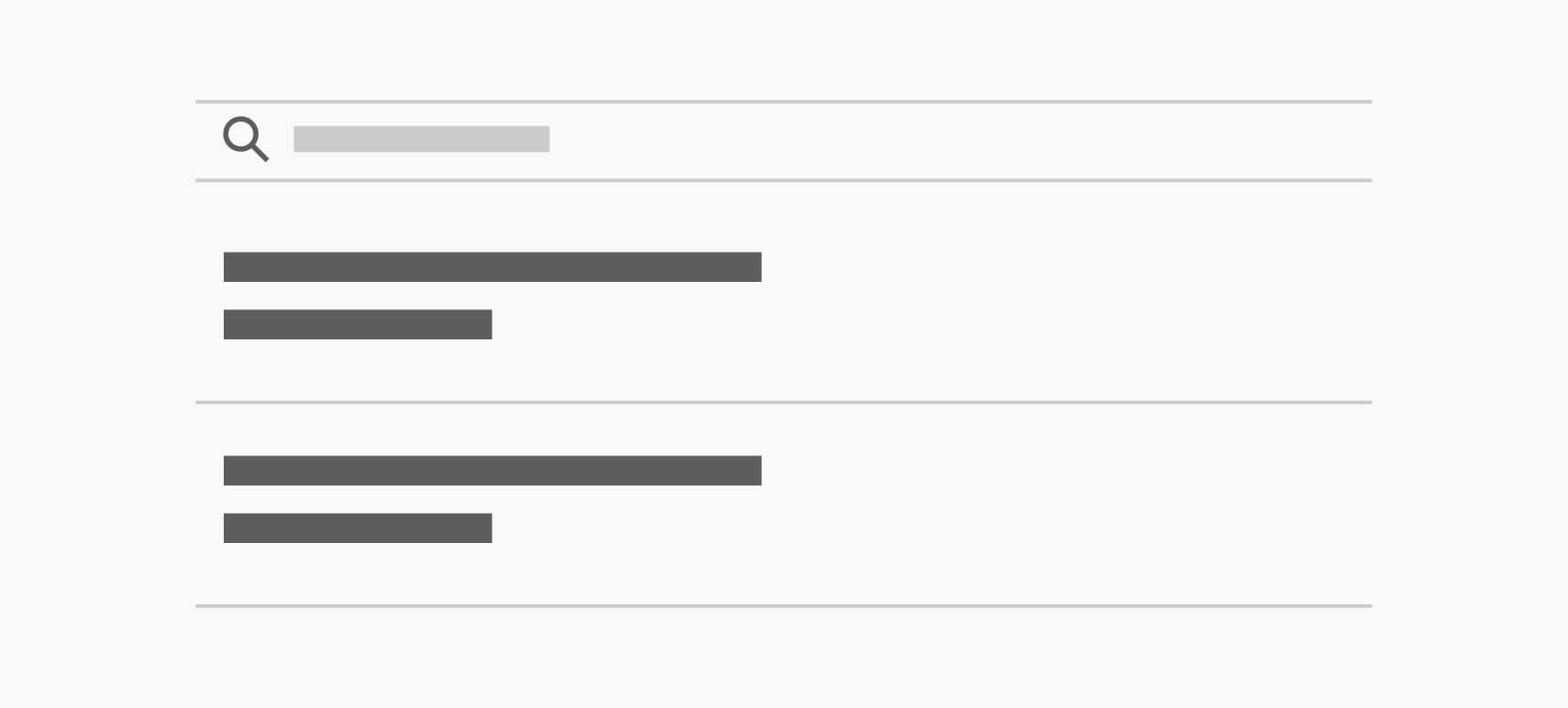
Filter helps visitors narrow a listing or explore a content set by a category or topic. It is useful when a page has multiple item types and needs a quick way to guide the reader to the right results.
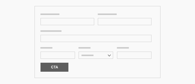
Form provides a structured way to collect visitor input, whether that is a contact request, signup, or application. It is a good fit for conversion-focused pages where the next step is to submit information.
Image is a flexible way to place a single image into a layout with the right sizing and presentation options. It is useful for portraits, illustrations, diagrams, or supporting visuals alongside copy.
Image Grid displays a group of images together in a consistent grid. It works well for galleries, references, before-and-after content, or any section that benefits from a visual sequence.
Logo Rail is designed for showing a row of partner, sponsor, or client logos in a clean, compact format. It is a good fit for trust signals on a homepage, about page, or campaign landing page.
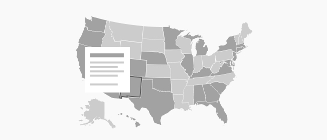
Map is meant for showing geographic coverage, service areas, or territory-based information. It is helpful on pages that need to explain where an organization operates or which regions are served.
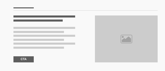
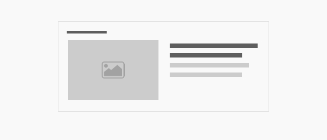
Media Duo pairs media and text side by side for a balanced promotional or storytelling layout. Use it for a feature highlight, a service explanation, or a section that needs one image with a clear supporting message.
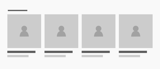
Person Group groups multiple people together in a readable card layout. It is useful for teams, staff directories, or contributor sections where each person needs a short introduction and image.
Pull Quote brings emphasis to a short statement, testimonial, or key message. It is a strong choice for quotes, testimonials, or editorial highlights that should stand out from surrounding copy.
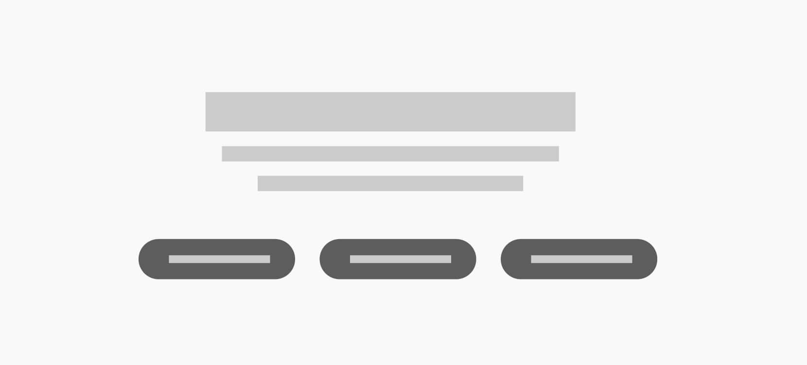
Simple Promo is a compact promotional block for a message, offer, or small call to action. It is useful when you want one clear next step without the structure of a larger content section.
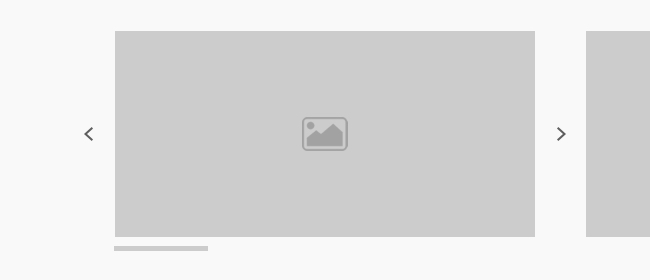
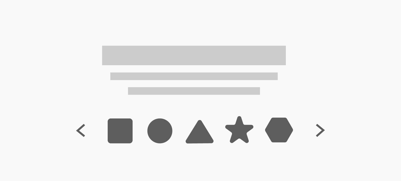
Slideshow cycles through a set of slides so you can highlight multiple messages or images in one place. It works well for featured campaigns, rotating announcements, or visual storytelling.
Statistic is a single metrics block for highlighting one important number with context. Use it to call out impact, a key result, or a quick proof point inside a larger narrative.
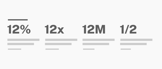
Statistics presents several metrics together so readers can scan a set of supporting facts quickly. It is a useful fit for impact sections, overview pages, or summary content.
Tab helps organize related content into switchable panels. It is useful when a page needs to group information into categories without making the page feel too long.
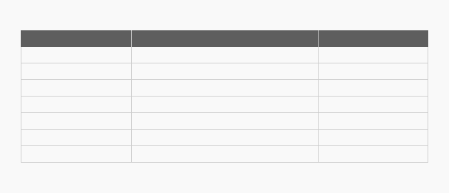
Table displays structured information in rows and columns for easy comparison. It is a good fit for schedules, pricing, feature comparisons, or any data that benefits from a clear grid.
Video lets you add video content with the right presentation and sizing controls. It is a strong choice for demonstrations, storytelling, or any section where motion helps explain the message.


